Tuesday, 30 July 2013

New S-One Custom Helmet

New fresh, raw and untainted s-one lifer from Double threat

really like the strap detailling

so shiny and untainted

logo location is gunna have to change but the strap rivets are awesome

that s1 logo will have to go too
So apparently I can't make a helmet last more than a couple of months without denting the shit out of it. I've been tempted by an S-One helmet for ages but they weren't really available in the UK. Then the lovely ladies at Double threat skates got them in, and I got the chance to go and have a look at them and the fit was much nicer for my over sized noggin than my old pro tecs. Thus I purchased a lovely one. The Pics show what I did with it. Trying out acrylic rather than enamel as a painting medium. Love the faster drying time but the transparency of the colour is very frustrating. The cleaning and brush maintenance is much better though. Also apparently only crazy people use enamel through an airbrush. Anyway, well chuffed with the outcome. hopefully this helmet will last a little longer
keying rub down and aperture stuffing, hurhur


more rub down

more rub down just to get out some moudling imperfections


crappy cardboard spray booth for the win,
the cardboard tube at the back has a silk filter
and is hooked up to the hoover for extraction

final pre base coat pic

tamiya field blue base coat and some black and white acrylic.
Trying this instead of enamel and cellulose

eye detailing begins,
(note the notebook full of different attempts as i couldn't work out which eye i liked)


tiny white detailling begins

they look so wobbly now

more white detailling, think i should have masked and sprayed those teeth now


roundel and lettering goes on

adding hints of paneling

distressing and silver bits and some oil leaks

adding signature tag , acrylic silver is pretty nice to work with


ok maybe got a bit carried away with the oil leaks

varnished and done

varnished with the logo in its new spot. well chuffed

Thursday, 20 June 2013

a very sutton impact logo

first stab at a concept
with a bit of improvement
  
monotone
vectoris
Possibly the first logo i ve been nagged into creating. Skater logo for mister Sutton Impact. Southern discomfort director and all star, sponsored by double threat and julian barrat look alike. brief was to create a logo that was something like a cheshire cat with a moustache and sutton's trademark red bowler.
after being really frustrated by the original two pieces the vectorised one took forever but am really chuffed with it.
personal adaption favourite


Friday, 14 June 2013

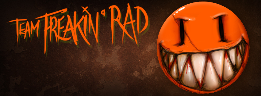
Team Freakin' Rad


an identity and set of objets de facebook for our sur5al team for the windsor sur5al

Monday, 10 June 2013

Friday, 10 May 2013

team Cymru logo update

to replace the rough sketch i did months ago. a final vectored bad boy with colour variants and everything

logo wot i designed on tshirts. Double threat love

lookeee looogggooo
proud. *snifffs* PPPPPURRRRRRROOOOUUDDDD.
lovely tiger bay brawlers wearing their sponsor shirts from
Double Threat Skates

Wednesday, 8 May 2013

team wales kit suggestion

done as a suggestion for the team wales kit, to go along with the logo that has all the bran story that i put further down the page with the logo.

Wednesday, 1 May 2013

picture drawings

There were so many epic cars in japan and I've always been a soft touch for a vehicle that is ubiquitous in a country, especially if it doesnt exist in the UK. Piaggio Apes are the perfect example of this. Japan was crazy for this, so many kei cars and vans. So I took loads of pics and promised myself I'd draw them. And guess what? I actually did one.


hosting dump


Tuesday, 2 April 2013

MORE DOUBLE THREAT IS MOOOOOOOOOOOOAAAAAAAARRRRRRREEEEEE

Their website is up and it looks epic.
Go visit them

Double Threat Skates Logo design

I can finally talk about this. So a few months ago the lovely Kitty Decapitate and Goregasm Ladyburger who both skate for LRG brawling asked me about designing a logo for the first bricks and mortar derby store in London. They had a really good brief but time was massively tight as crash and I were off to japan. They were epic clients and what we came up with was this.


Clean, impactful, single colour, incorporating the London skyline and moving the conversation forward from the usual distressed type and punk lettering.
I'm so proud of it and love seeing them bringing it to life.


so check them out here